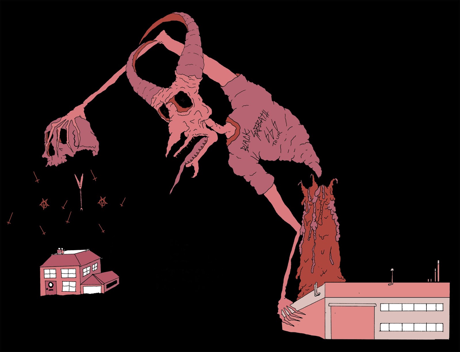
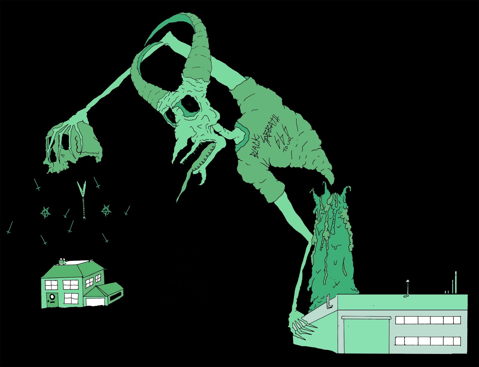
The use of colour is a key focus when thinking about Vanitas works as a monochrome use of colour is used giving the images a gloomy dark feel. I have been working out which colours have the best range when using all the different shades and tones to make a monochrome colour scheme, to see if this could work in my own practical. I wanted to make sure black was one of the main colours I used as the majority of metal bands albums are mounted onto black, and in religious images black and shading is used to create the gloomy feel. However hrough my research I had noticed that sometimes in order to redefine and brand an image bands have used brighter contrasting colours that draw the viewers attention. This also gives the image a more modern feel. Below are some of the images I played around with.


No comments:
Post a Comment