So here are my final designs that will be mocked up on my final products.
I like how these final designs came out and the fact I have done all the final editing on Photoshop makes me very happy as its a area iv been trying to improve on for some time, I feel like these designs show i can now use the software with confidence.
I nearly forgot to add the band names to all of these so when doing this very last minute i was worried how the where going to look on the designs but again because of the advantages of digital design i was able to edited these in quick time to the effect i wanted them to have on the final design.
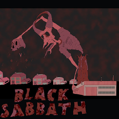 |
After doing this design just as a mockup i liked how surreal a sense it set with the off level buildings and the scale changes. I felt that this fit with the surrealness of the chimney been a candle and a demon/devil towering out of it, it made the whole image more surreal. I set out to create a image that showed the start of the heavy metal counter culture after discovering its said to have been born from the industriousness of the metal industry in the midlands.
Really happy with how the text looks it could be from the 70s old hippy style acid tripping scene. |
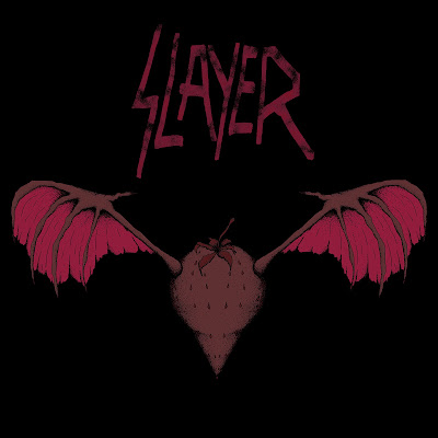 |
This cover I feel fits well with the semiotic meaning a strawberry carries from a Bosch painting, this combined with the devilish wigs its been gifted with help imply the evil within the fruit and the sin it represents.
Again im very happy with how I got the text to look with the dissard effect that looks sinister in its self. I could maybe look at applying the effect iv used on the text to the strawberry but it would of taken away the shading and made the image appear flatter. |
 |
This is the cover I struggled with most trying to give it a Vanitas style look with the semiotic value to each object that could like to the Heavy Metal culture. I liked having to draw multiple objects together that would portray the same message of Death as i was going for the most transgressive message with this one.
I am happy overfall with the images i have produced, but i feel that they would struggle to fit in a alitte in the Heavy Metal world as i feel that the style i have is a little tame, a bit too cartoon like. If i can address this by continuing to study this area and make my images more gritty, give them a feel of gloom and doom.
Im happy with the amount of black i have used i just feel that the finished images dont shout transgressive much at all besides for the symbols associated with satanism. |
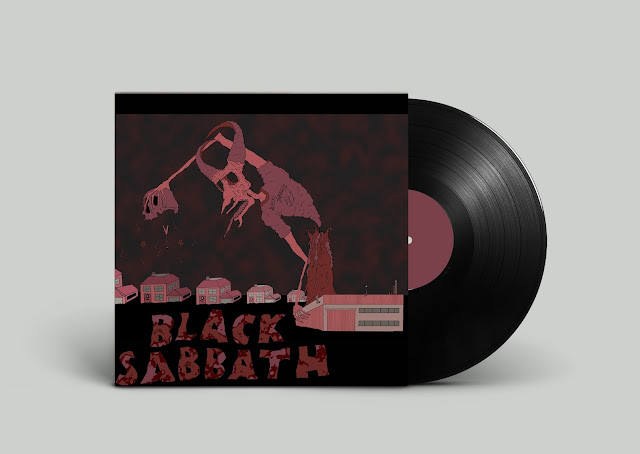
Here I have mocked them up on tho the front of record sleeves to see what they would look like as they where designed for this task. I have to say im very chuffed with these as i feel like as I had considered them to be done in a square format for records or album covers this helped with how the final image have worked.
If i was to do this again i would come up with some illustration for the center lble on the vinyl its self as this would finish of the product nicely.




No comments:
Post a Comment