Wednesday 11 January 2017

Statement of intent

Summative Statement

I have focused my attention for my COP3 to an area that I have never really understood before but always intrigued me, the use of imagery in heavy metal counterculture. I have noted that often religious group’s get offended by images used in counter cultures particularly those that resemble the images used historically by the Christian Church. Heavy Metal has used these type of images and therefore been labeled as Satanic since its birth in the 60s/70s.

When looking into why these images are used a number of things became clear. I found that historically these religious images were used to provoke a sense of fear into people in order to show them what will happen if they commit sin. All of this was done in order to control them, they have been continued to be used until the present day a few hundred years later however now are used as a visual with a transgressive meaning.

By decrypting the reasons and meanings of the semiotic values of the paintings done in the 16th/17th century’s I have been able to understand the full meaning behind the images. The paintings that I looked at were done or commissioned by the church but featured scenes of torture and mutilation and images that would be seen as very anti-religious and barbaric today.

By looking at the semiotic meanings that objects hold I have been able to inform my practice more and better understand why these images are seen as transgressive by understanding why they are used in heavy metal counterculture, as a way to kick back against society and give people who do not identify with the general culture a voice .
This has given me the confidence to carry on looking at this area of my practice and I feel better equipped in knowing and understanding the true origins of the fabricated fear associated to the Heavy Metal counterculture.
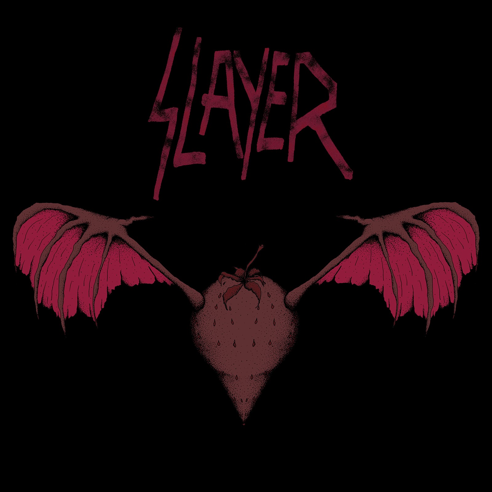
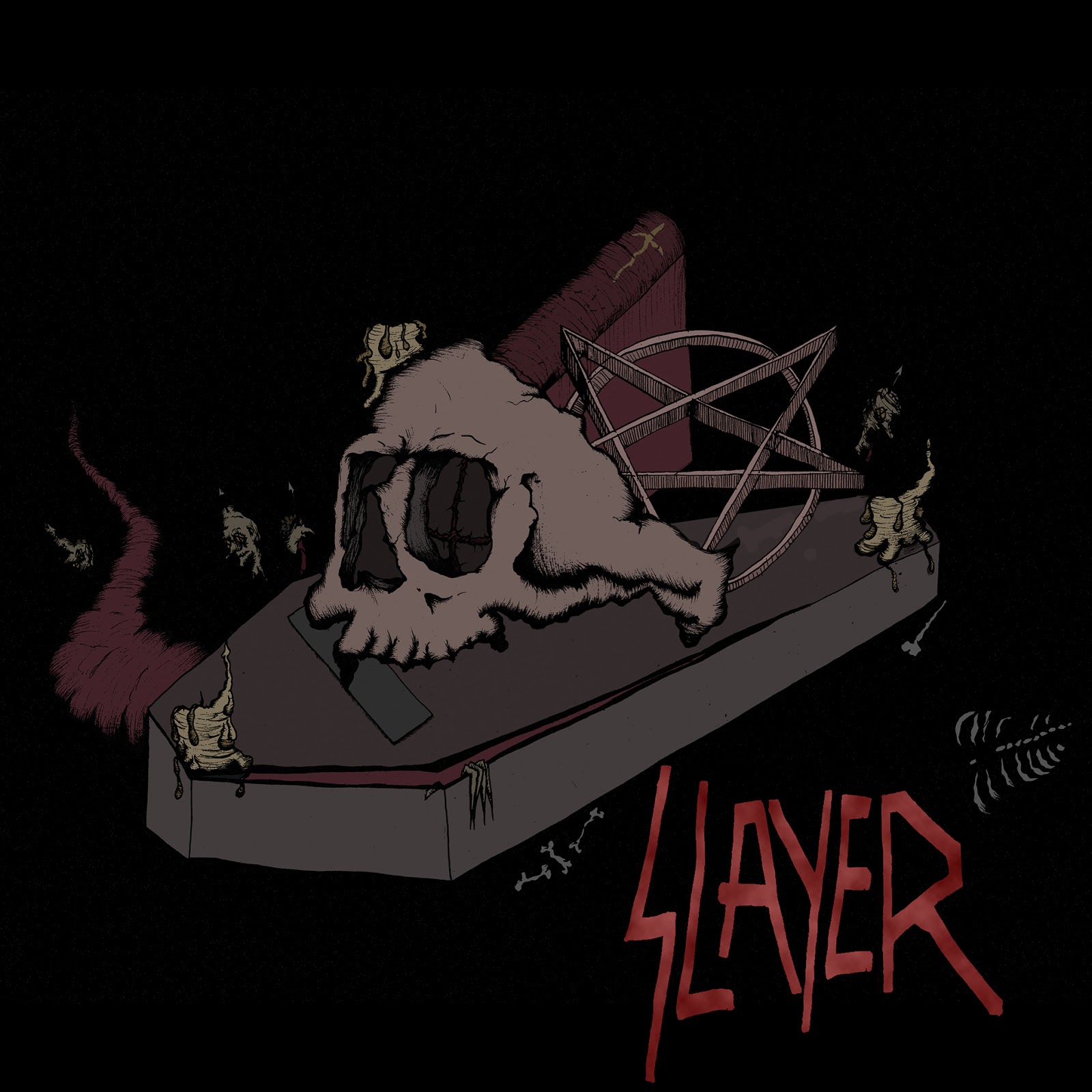
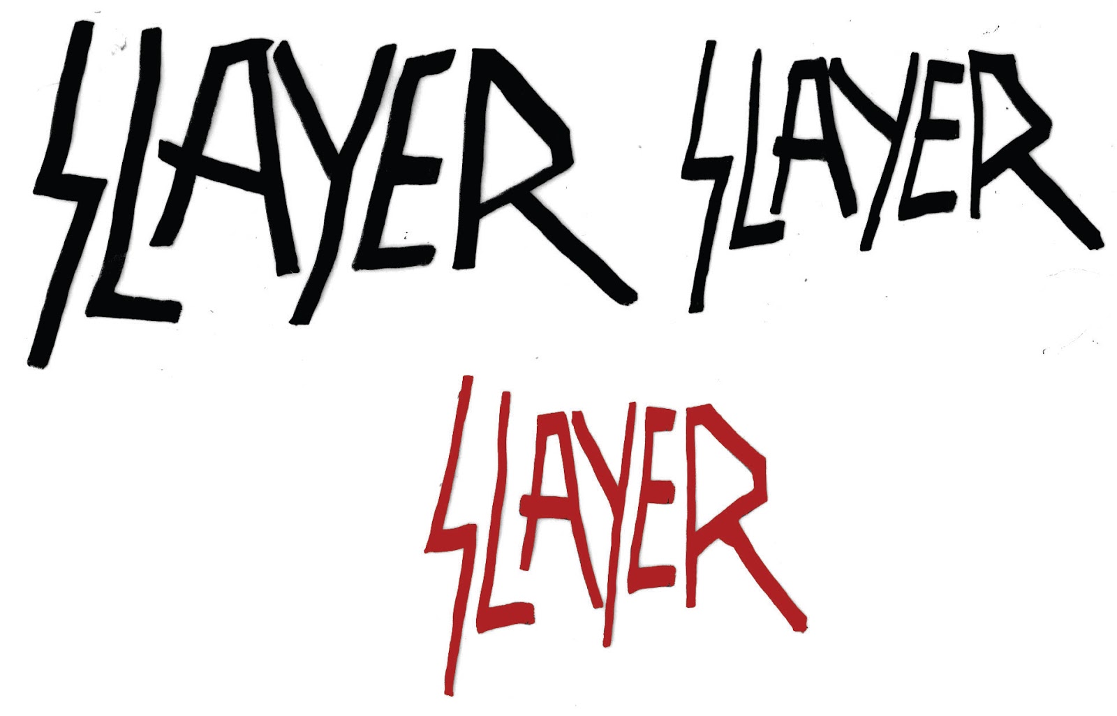
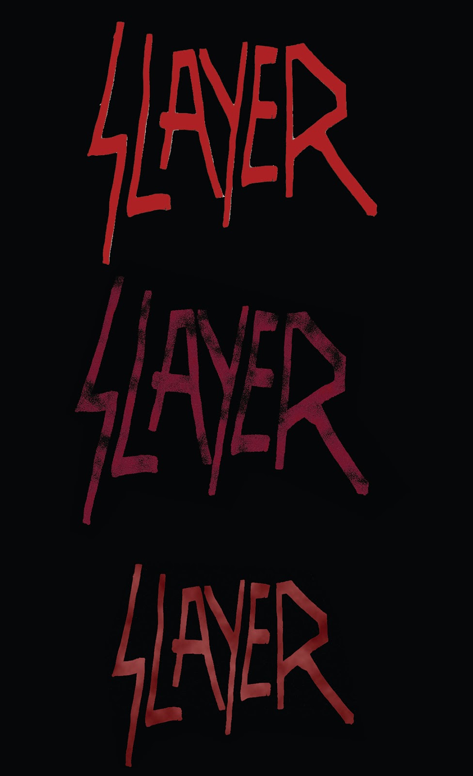
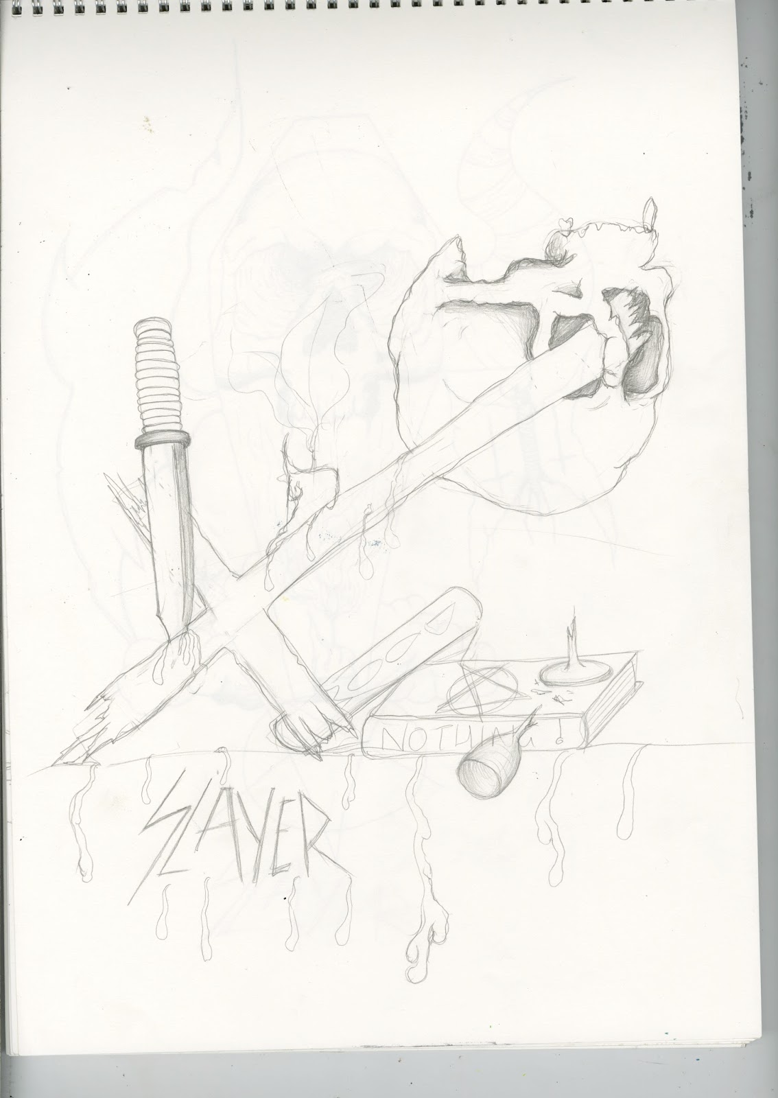
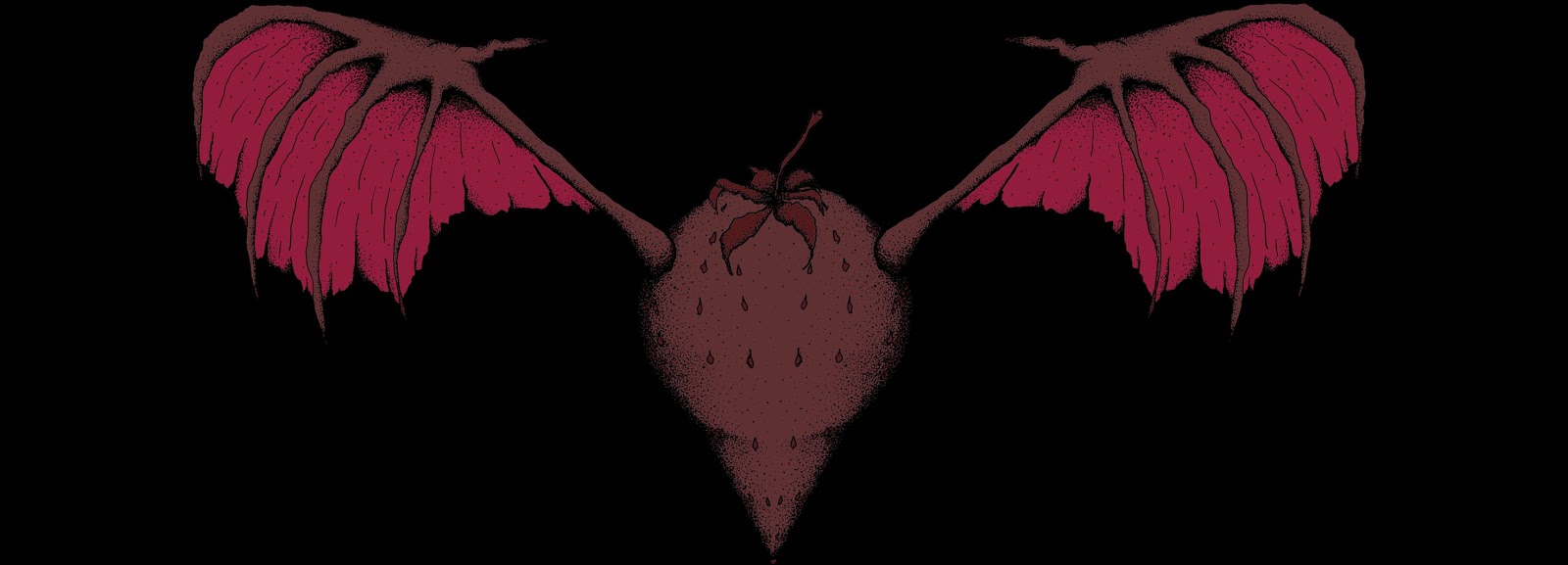
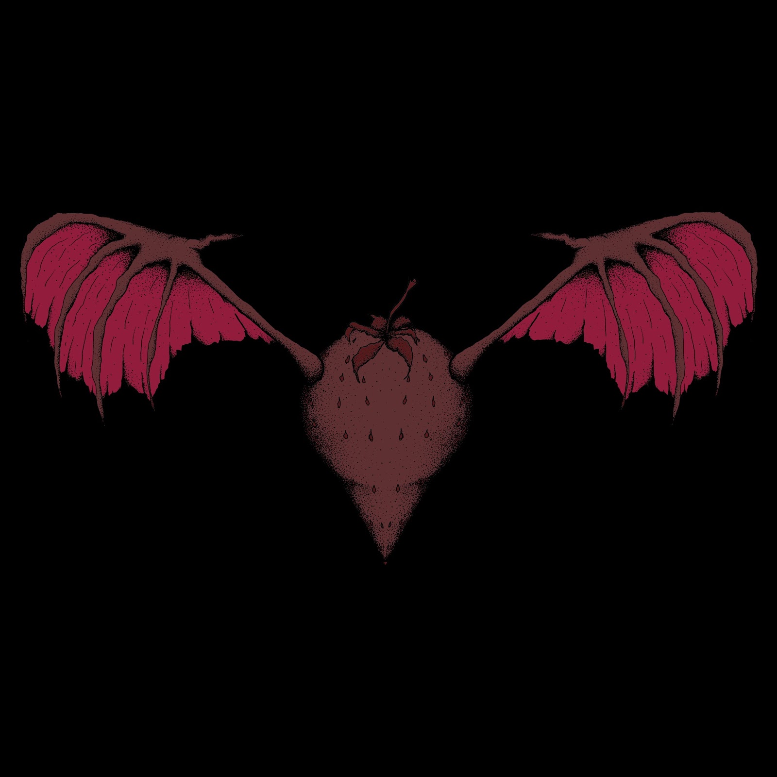
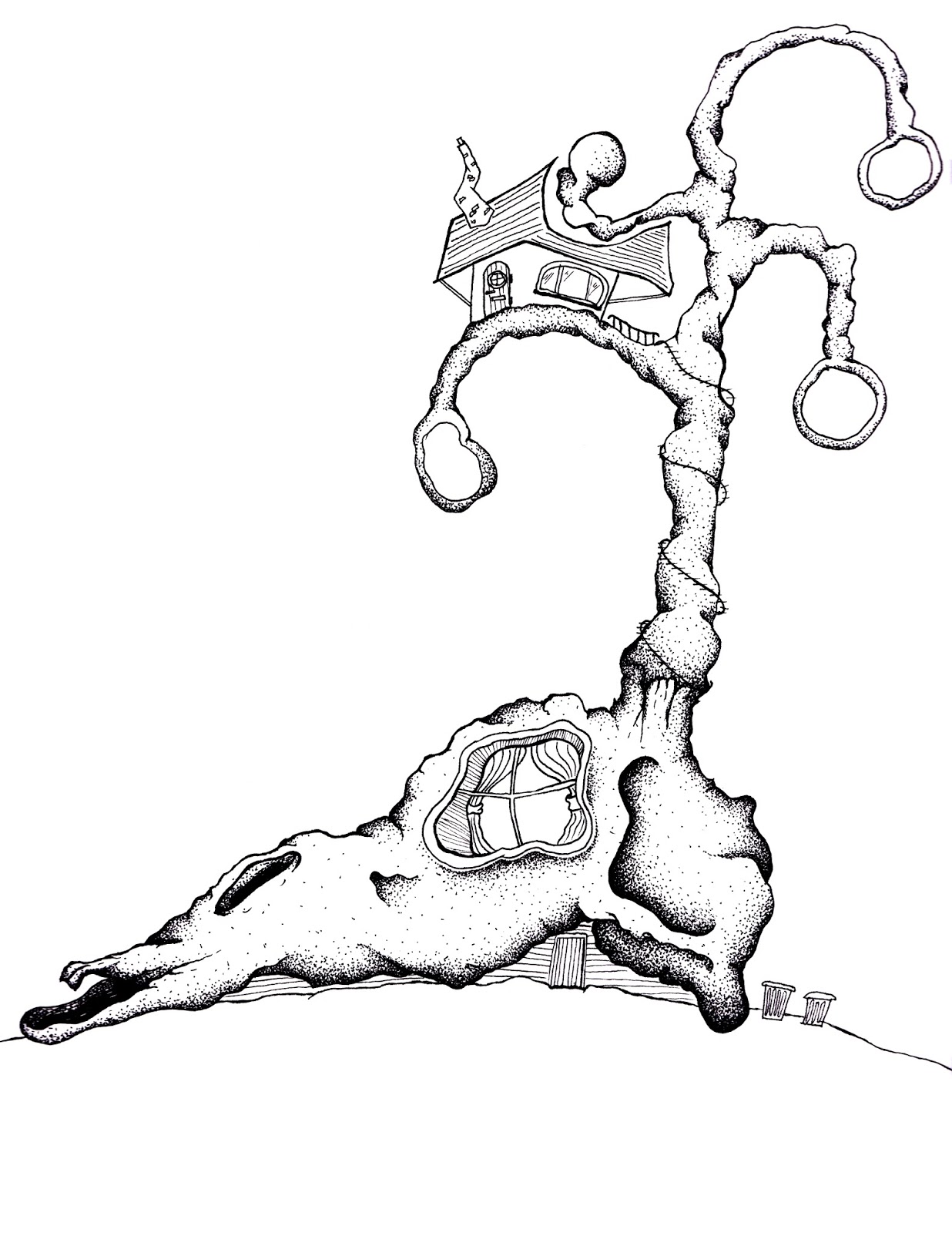
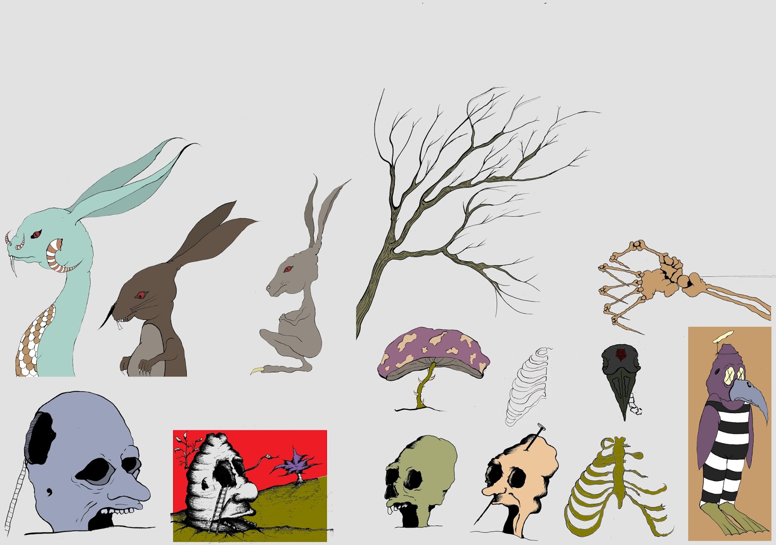
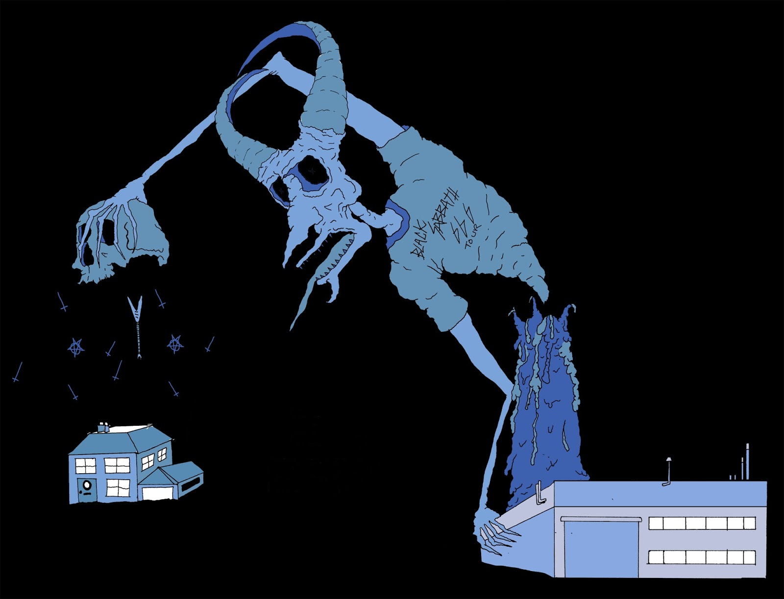
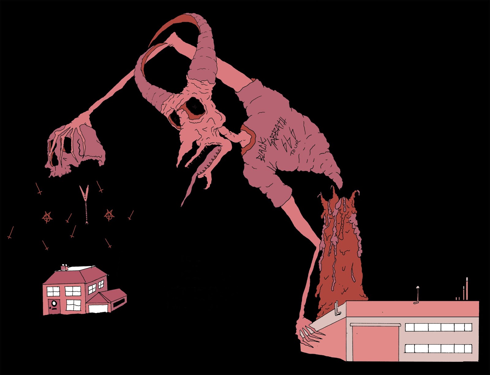
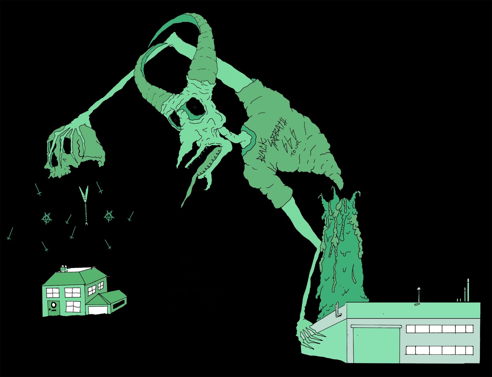
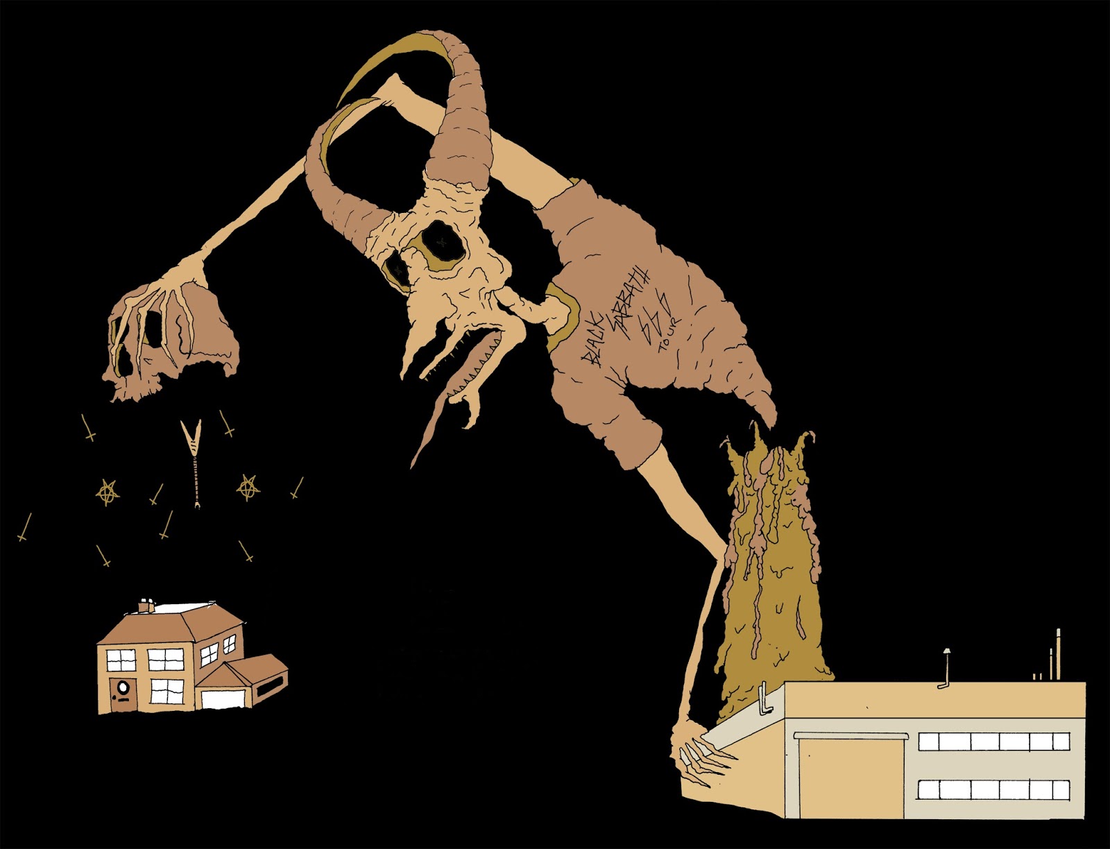
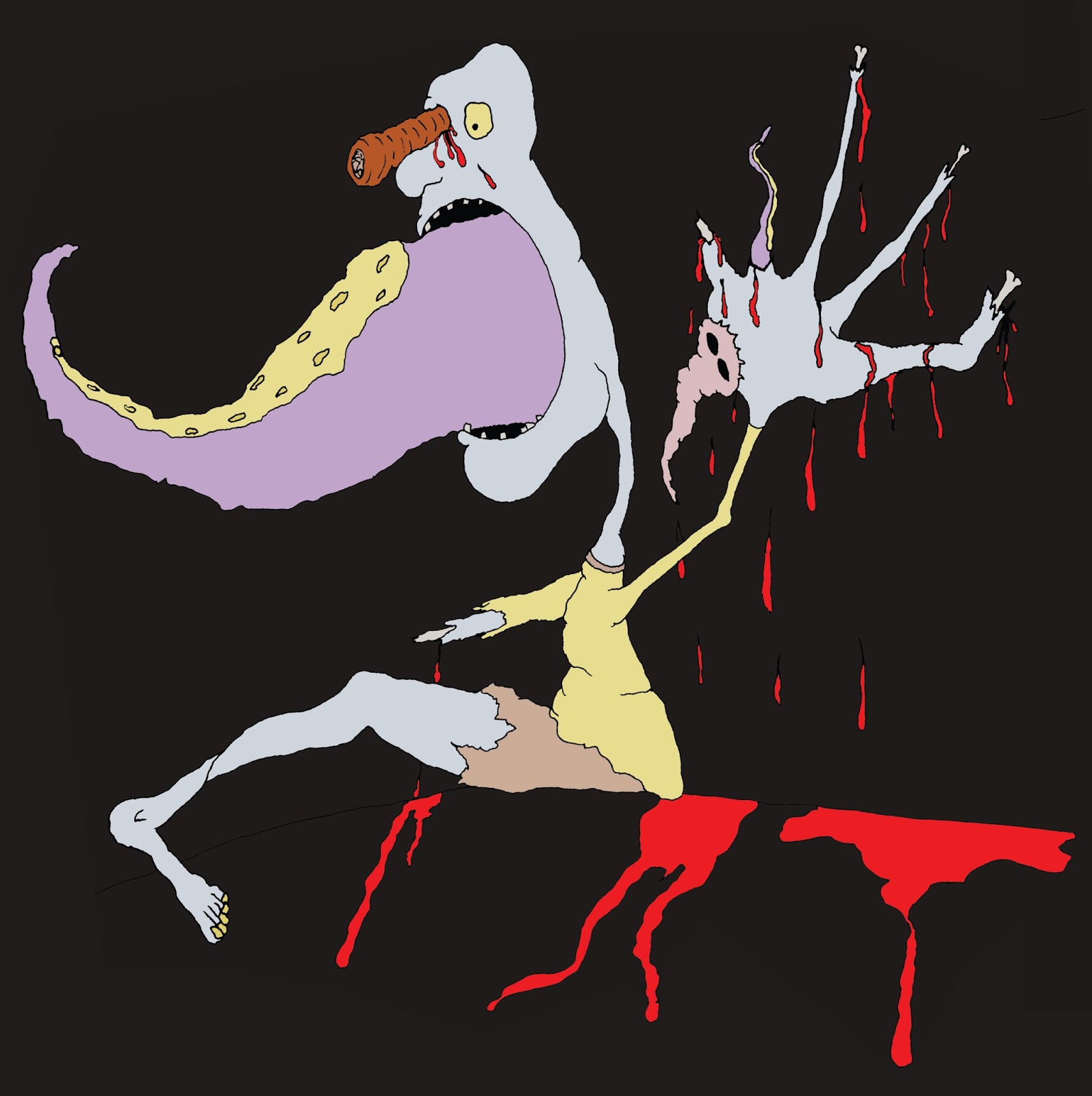
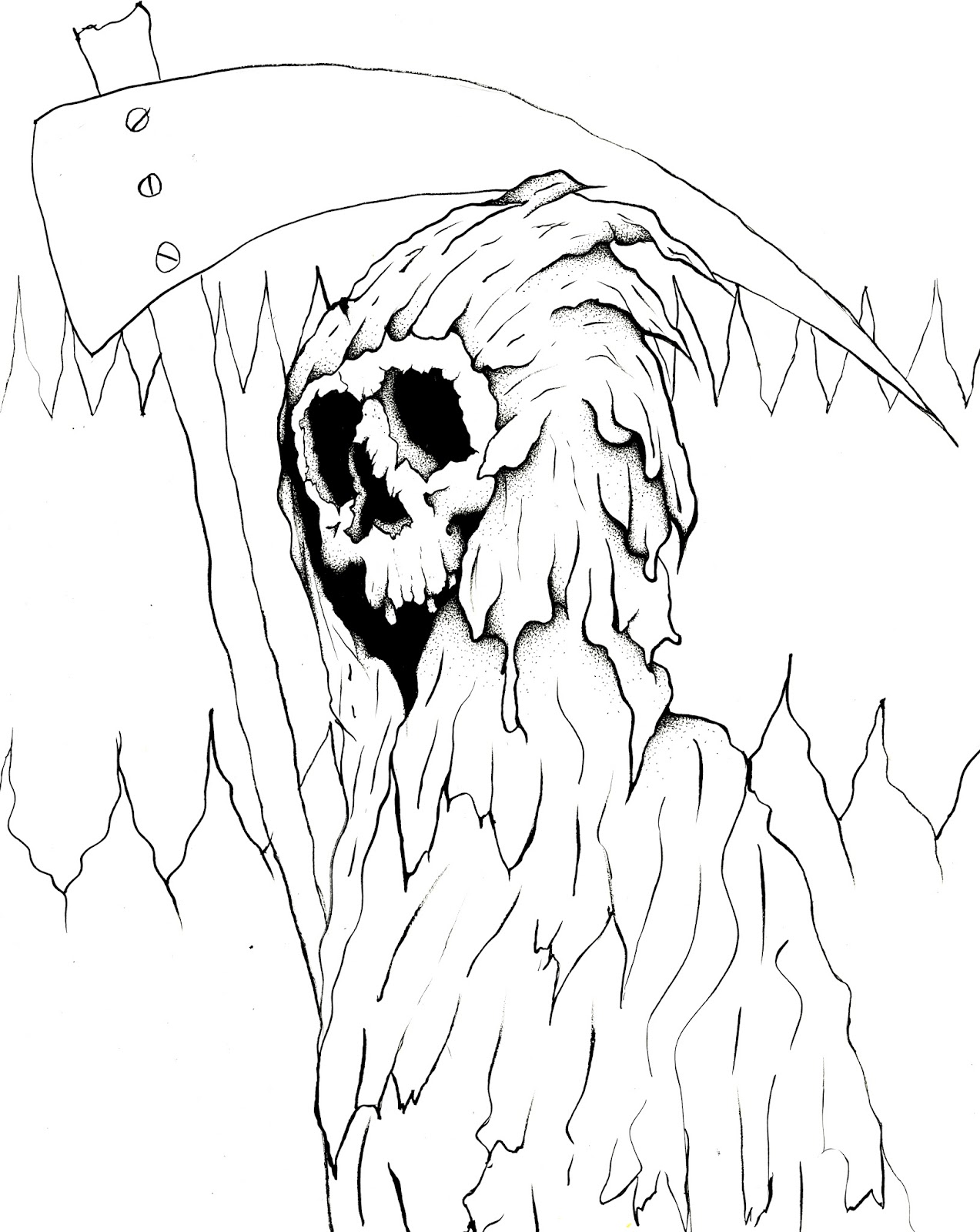
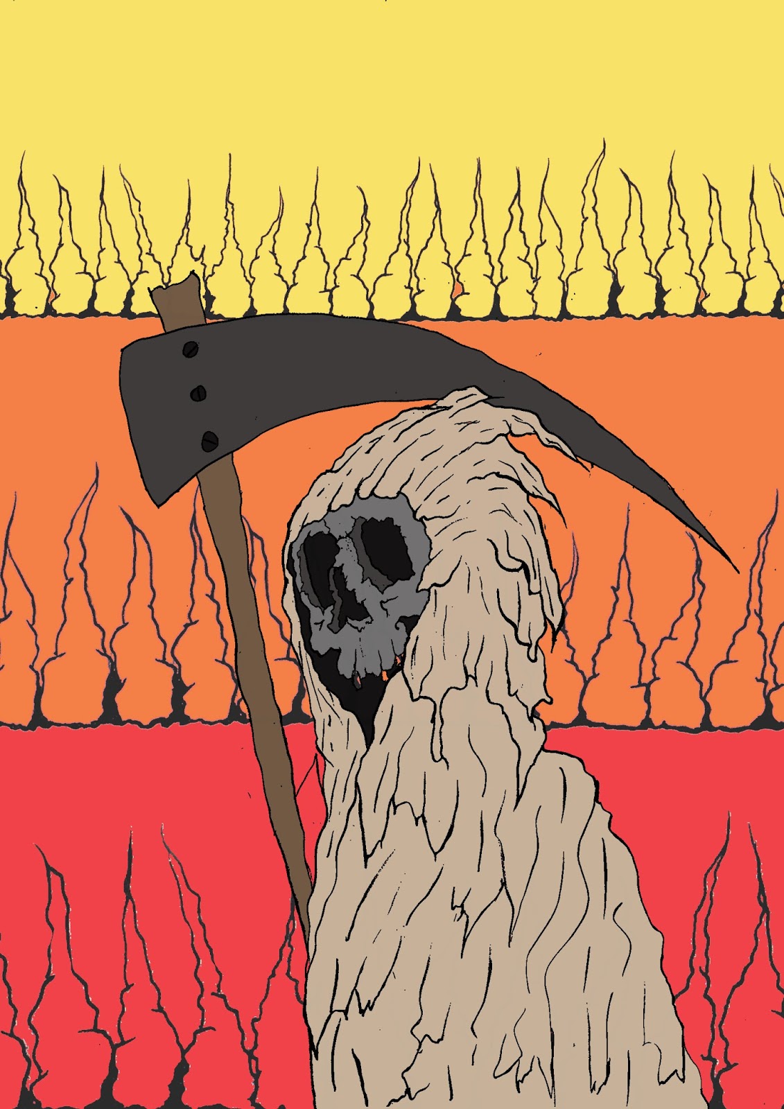
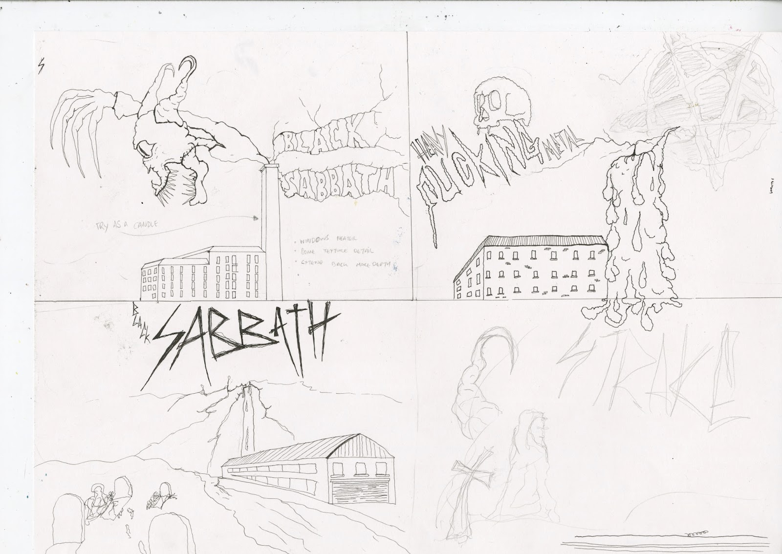
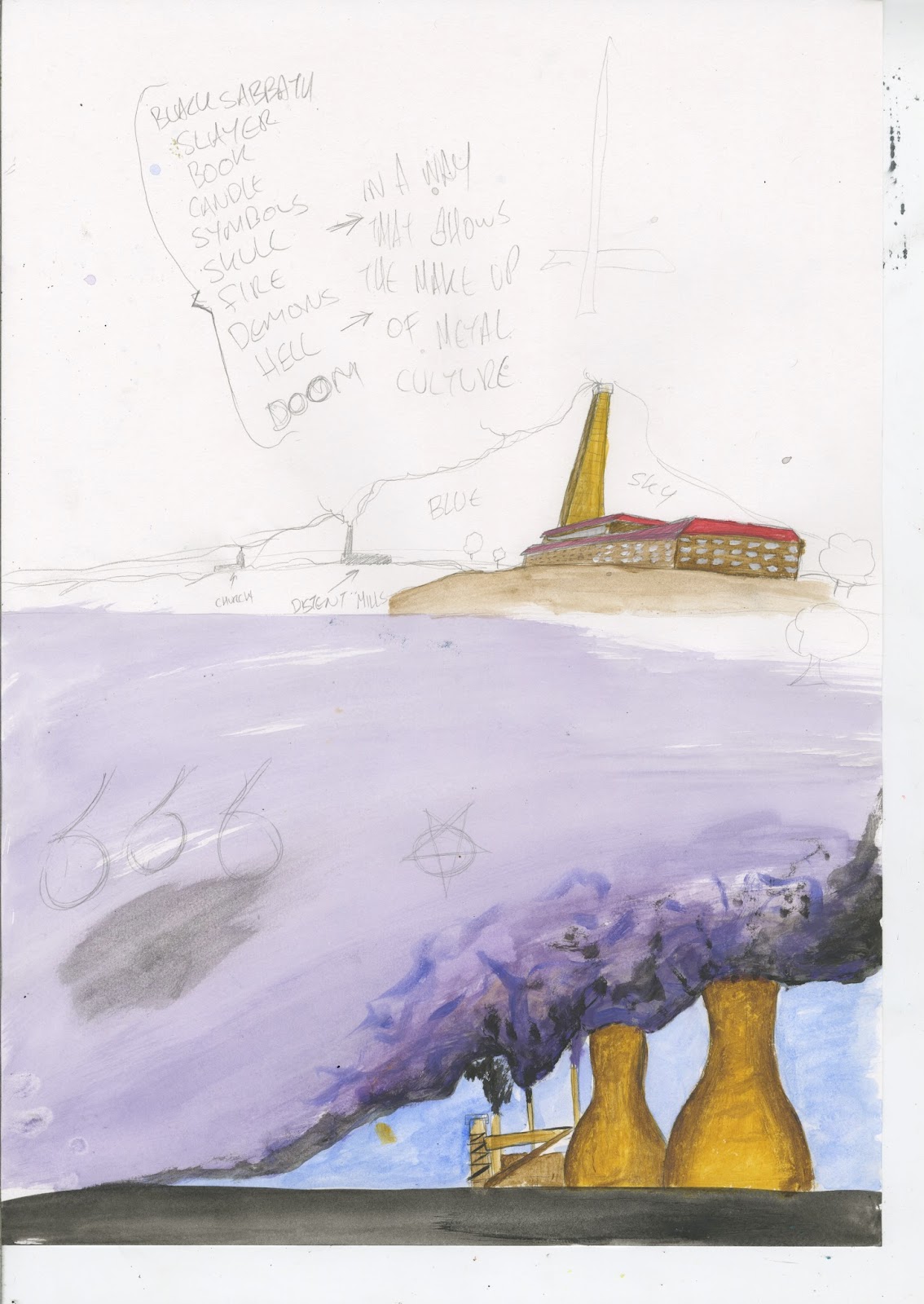
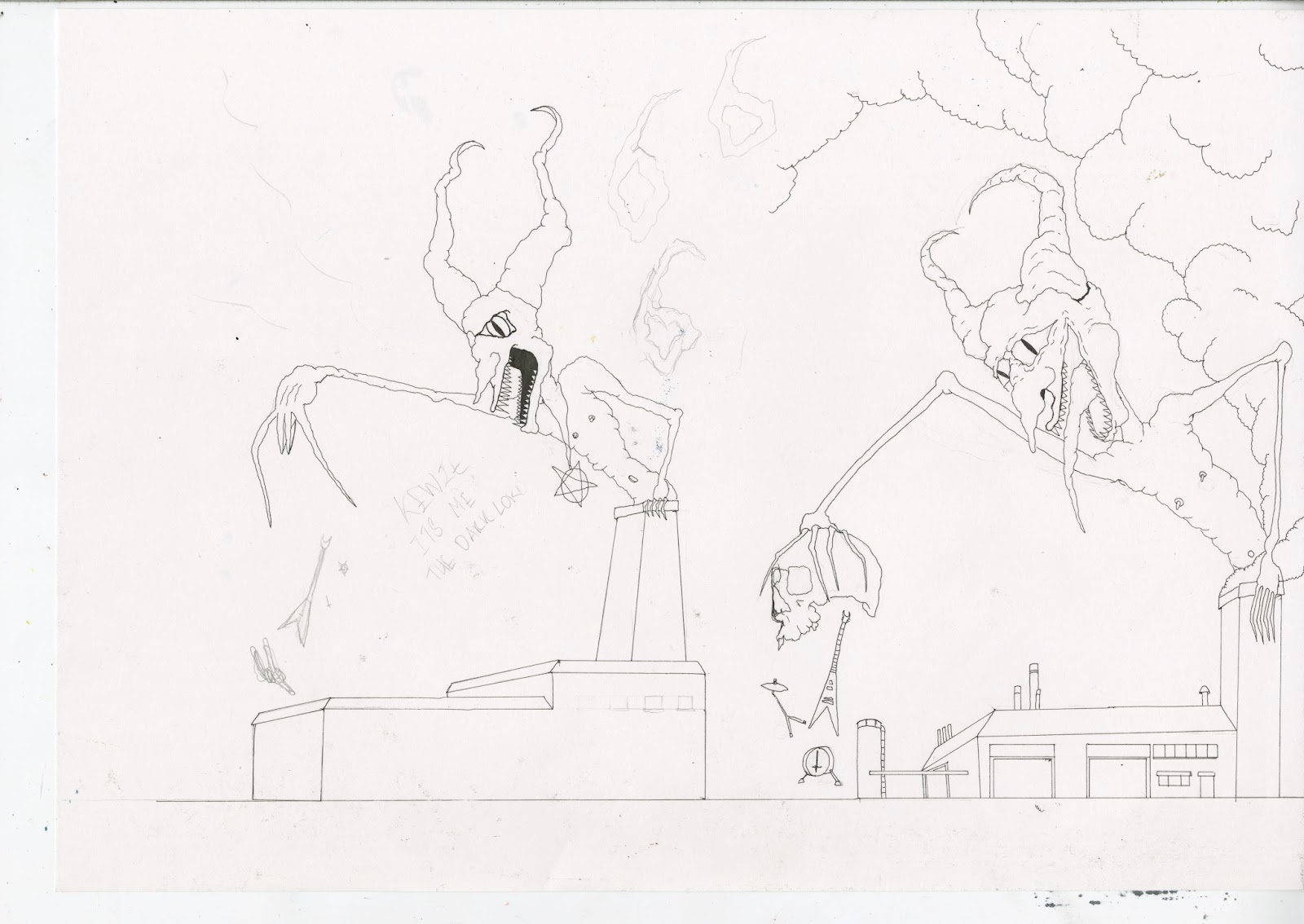
I created artwork for the bands that demonstrated the best used of the transgressive attitude. This has been done through the use of semiotic value.

Presentaion Boards

FINAL DESIGNS and ON PRODUCTS

So here are my final designs that will be mocked up on my final products.
I like how these final designs came out and the fact I have done all the final editing on Photoshop makes me very happy as its a area iv been trying to improve on for some time, I feel like these designs show i can now use the software with confidence. 
I nearly forgot to add the band names to all of these so when doing this very last minute i was worried how the where going to look on the designs but again because of the advantages of digital design i was able to edited these in quick time to the effect i wanted them to have on the final design. 

After doing this design just as a mockup i liked how surreal a sense it set with the off level buildings and the scale changes. I felt that this fit with the surrealness of the chimney been a candle and a demon/devil towering out of it, it made the whole image more surreal.  I set out to create a image that showed the start of the heavy metal counter culture after discovering its said to have been born  from the industriousness of the metal industry in the midlands.
Really happy with how the text looks it could be from the 70s old hippy style acid tripping scene.  

This cover I feel fits well with the semiotic meaning a strawberry carries from a Bosch painting, this combined with the devilish wigs its been gifted with help imply the evil within the fruit and the sin it represents.
Again im very happy with how I got the text to look with the dissard effect that looks sinister in its self. I could maybe look at applying the effect iv used on the text to the strawberry but it would of taken away the shading and made the image appear flatter. 

This is the cover I struggled with most trying to give it a Vanitas style look with the semiotic value to each object that could like to the Heavy Metal culture. I liked having to draw multiple objects together that would portray the same message of Death as i was going for the most transgressive message with this one. 

I am happy overfall with the images i have produced, but i feel that they would struggle to fit in a alitte in the Heavy Metal world as i feel that the style i have is a little tame, a bit too cartoon like. If i can address this by continuing to study this area and make my images more gritty, give them a feel of gloom and doom.
Im happy with the amount of black i have used i just feel that the finished images dont shout transgressive much at all besides for the symbols associated with satanism. 

Here I have mocked them up on tho the front of record sleeves to see what they would look like as they where designed for this task. I have to say im very chuffed with these as i feel like as I had considered them to be done in a square format for records or album covers this helped with how the final image have worked.


If i was to do this again i would come up with some illustration for the center lble on the vinyl its self as this would finish of the product nicely.

Tuesday 10 January 2017

Bosch and symbolic use of musical instruments

Bosch and symbolic use of musical instruments

Bosch uses musical instruments in his depiction of hell, these are used as instruments of torture in the section know as the Music from Hell. They are seen as sinful, the church censored music at this time and only religious music was allowed. If in the present day music is still censored by the establishment which has been historically linked to the church even if it less restrictive than at this time.

I thought it might be interesting to use this idea but instead recontextualize the image to give a different meaning. Rather than restrict, liberate people to play what they want regardless of cultural boundaries.
These instruments only appear in the hell panel as its said that they where used to create music that was not approved by the church. This was a sin worthy of a eternity in hell ? If you wanted to play music it had to be of the church kind spreading the message of the baby jesus.

You can see them as large objects in the panel dedicated to hell

Band Text Bradning

I have very nearly forgot all about this and nearly forgot to add them to the final designs.
With doing the record sleeves for real band that i like i had to add the text as it has been used in the past. I just looked at how the bands had used they name to advertise them self on they records and replicated that.

With the SLAYER lettering i found this very simple to replicate has is all straty lines with straight angles. For this i just used a Calligraphy fine liner and using the wide section for the down strokes and the tine edge for the change in direction.

This is the text the band use on one of they most famous logos 


After drawing it out i then scanned it into photoshop where i first changed the levels to get the blacks nice and black. Then by just selecting the letters i filled in red, with this done i then added the effects of clouds from filler section, then i change the settings in the hue/saturation to make the effect go to red and darker tones. ON the bottom center one i did the effect but could nit get the red i wanted so i added a layer of red above turned down the opacity to get the effect to come though but keeping the letters red


With the Black Sabbath text i just used probably the most recognisable one for it has been on the covers before.


I just freehanded the letters then scanned it in and did the same as the slayer text. But one I got to the final steps i selected the different tones  that effects had created and filled it with solid colour from the image it was going to be put with to try help it blend in with the monochrome finish. When i did this it looked like a acid trip effect and i know i had to use it.

All things point to Death- Album Cover -Slayer

So i wanted to do a cover for Slayer that had the meaning of Death all over it but in a semiotic and visual way that is undoubtedly a bit of a transgressive theme. by sketch quite afew vanitas style lay outs i decided to work towards that style for this image.

Here are a selection of my roughs/sketches done to help me work out what layout and items to included in the image. As it was focusing of the death theme it had to be a Skull as the most focal point. Using other objects such as symbols like the inverted pentagram and cross which to some represent evil and satanic values.
 Using broken glasses to suggest some frome of indulgence in the booze as as its broken could mean a good time or a good time turned bad.

On here i have used a shell to show the exotic travel/tour a band might take on in the journey to metal fame. Also added a snake to suggest the snake in the garden of eden as it sums up all sin,  some inner storytelling like Bosch within the over all image. 


With these I started playing around the the idea of putting a coffin shape in the image as this is the last resting place for the majority of people. I like how it works with the semiotic value it brings but im just dont like the feel of the composition everything is in in these mockups. 

Friday 6 January 2017

Final Peer Review

Had my final peer review today which was really helpful to ensure all my work is going in the right direction. Key points to work on:

- be more explicit of why I am producing certain images and explain how they relate to the research
- need to complete summary statement to link theory and practice and outline my intention
- clarify which images are my final pieces
- clarify reasoning for use of processes
- needs to explain things better
- presentation boards need refining

Thursday 5 January 2017

LUST strawberry

ONe of my final ideas is to use the sinful semiotics of a strawberry from the time of H,Bosch and try emulate how he used a simple fruit to add so much more meaning to the images in his paintings. Lust seemed to be a very fearful sin and Bosch made suer you knew this is you looked at the garden of earthly delights.
 Using dots and a small out line i built up the shading, whilst doing this i realised i only like the right hand side wing so i halved and flipped the image and stuck it back together to create a nice plump strawberry. With doing this the leaf/stem was mirrored and looked very out of place so i just took the original image and deleted all the unnecessary bits just leafing the stem and leafs then applied this on a layer above and it fit back on nicely.
 Using the red monochrome and heavy black background  approach again to colour this fruitful beast. I like how this is developing i just want to try a few more things with to see if it can be improved any further, but i need to make sure i don't get carried away and over work it.


-colour of fruit to be brighter than other elements the wings stand out more then the strawberry
-screaming mouth to fruit?
- inverted/pentagram in background

Wednesday 4 January 2017

Bosch inspried world

BY looking at how H.Bosch uses the  objects in his paintings to give them a new meaning or reinventing them to give a more sinister rureal look. I really liked how he does this so i took my favorite image to draw the humble skull and tryed to turn it into a nice cosy home for the undead world. I like how these have satrted to work in the way a want them too by looking like they origal dead skull selfs but also a home. The only thing i feel i could do with working on some more is the colours used try and use  more earthly tones to creat a feel of gloom hell and not of Wonka world.


Monochrome study

The use of colour is a key focus when thinking about Vanitas works as a monochrome use of colour is used giving the images a gloomy dark feel. I  have been working out which colours have the best range when using all the different shades and tones to make a monochrome colour scheme, to see if this could work in my own practical.  I wanted to make sure black was one of the main colours I used as the majority of metal bands albums are mounted onto black, and in religious images black and shading is used to create the gloomy feel. However hrough my research I had noticed that sometimes in order to redefine and brand an image bands have used brighter contrasting colours that draw the viewers attention. This also gives the image a more modern feel. Below are some of the images I played around with.


Hieronymus Bosch Style practical.

Looking at the painting  The Garden Of Earthly Delights by H,Bosch I have started to come up with my own versions of beasts and other kinds of weirdness that the great master used himself. By doing this i can start to understand why Bosch painted his images the way in which he did. I feel that his images are made up of multiply array of stories making you one overall message that the established order would spoon feed they followers. 
I have been studying the painting and they are elements that jump out and get your attentions every time you look at it. The way the painting flows from left to right on a journey of sin and lust, ending in the depths of hell full of sinners meeting they eternal hell. Within these different panels they are numerous beast and very surreal looking actions.  
These images i have done could definitely be related to the final panel that is hell with torture, mutilation and beast if you came face to face with would install fear. 
I really like how he tuns many different objects to buildings manly the human head one as i feel this shows a kind of demonic hell where you will face eternal suffering and you are conscious throughout this.  The only issue is many of my drawings do look a bit more cartoon like, however this is part of my own style so might make the images a bit more unique.
Based on the mutillaion showed in the end panel of the garden of earthly delights. 


A beast like chicken


A grim reaper mr death employee of the underworld


Here are a few quick layouts for the environment to maybe set the mood of a overall image, i have quickly roughed out some quick ideas for buildings that could be set in a hell looking world. 


Tuesday 3 January 2017

Metal born from industry- Album cover

For my cover for the mighty Black Sabbath I focused on the birth of heavy metal which is said to have started in the Midlands in the 60s/70s where the metal industry with its foundries and mills where everywhere. The sound of the huge hammers beating metal into shape was said to be deafening and this happened all day every day combined with the smoke from the chimneys that some say you could taste the metal in the air.
 I settled on the idea of a demon/Satan coming out of a chimney as what would be the smoke from the foundry, this would be covering the town above but in the shape of the unholy one.

 So to start with roughs where done to help me decide on the layout of the scene. I have seen and worked in quite a few factories so I use this as a starting point to draw from. I quickly decided how I want this to look as I had been thinking about it as a idea for some time. I then decided to add a candle shape to one(top right) of the chimneys to see how this would look, i took this from the Vanitas paintings as it symbolises the pasting of life. And it adopts the surrealness of H.Bosch in creating a image with containt with hidden meaning in a semiotic value.
I really liked this idea and how it looked.


The bottom chimneys are based on the Tinsley Towers which used to great one on the M1 motorway to let you know you was nearly home. But sadly these are now gone and you have to look at meadow hall insead. 

Here is the last remaining mill from where i live in Guiseley, Leeds when i grew up here there was about 4 or 5 other big chimneys towering above the roof tops. but now there is just once this one. I was lucky enough to see it working last year. 


I was curious to see how acrylics paint would look to set the mood of the image. As i was working on cartridge paper that was not of a standard to take a beating me and a paint brush would give it this would take too long and it have to be careful with how i applied the paint, this is not how i like to use paint. So it was decided it would be coloured on photoshop. This would also save me time in changing and altering the colours if i needed to. 
Then i wanted to add more to the idea of Satan holding a skull, again taken from the  Vanitas meaning for death but used in a H.Bosch way as musical instruments are falling out of the skull, trying to imply that this is the Devil giving music back to the people to make themself be heard, there for giving them HEAVY METAL.

I had found the perfect image to build up.