With doing the record sleeves for real band that i like i had to add the text as it has been used in the past. I just looked at how the bands had used they name to advertise them self on they records and replicated that.
With the SLAYER lettering i found this very simple to replicate has is all straty lines with straight angles. For this i just used a Calligraphy fine liner and using the wide section for the down strokes and the tine edge for the change in direction.
 |
| This is the text the band use on one of they most famous logos |
After drawing it out i then scanned it into photoshop where i first changed the levels to get the blacks nice and black. Then by just selecting the letters i filled in red, with this done i then added the effects of clouds from filler section, then i change the settings in the hue/saturation to make the effect go to red and darker tones. ON the bottom center one i did the effect but could nit get the red i wanted so i added a layer of red above turned down the opacity to get the effect to come though but keeping the letters red


With the Black Sabbath text i just used probably the most recognisable one for it has been on the covers before.
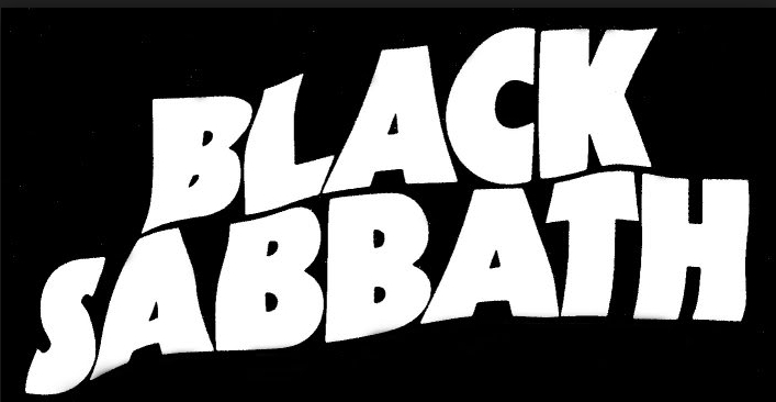
I just freehanded the letters then scanned it in and did the same as the slayer text. But one I got to the final steps i selected the different tones that effects had created and filled it with solid colour from the image it was going to be put with to try help it blend in with the monochrome finish. When i did this it looked like a acid trip effect and i know i had to use it.

No comments:
Post a Comment